Evergrow
Project Costs: Developer Experience
New Feature | December - March 2025

Role:
UX & PM lead
Team:
Tax Credit Finance Expert
Sr Software Engineer
Evergrow's business model depended on efficient diligence at scale, but gathering project cost information was a time consuming headache for everyone involved.
We delivered a modern workflow that smoothed information handoffs and empowered developers of all experience levels. Processing time dropped by 80% on average.
Evergrow bundled small tax credits from Commercial & Industrial clean energy developers for large buyers. A key value proposition was efficient diligence at scale.
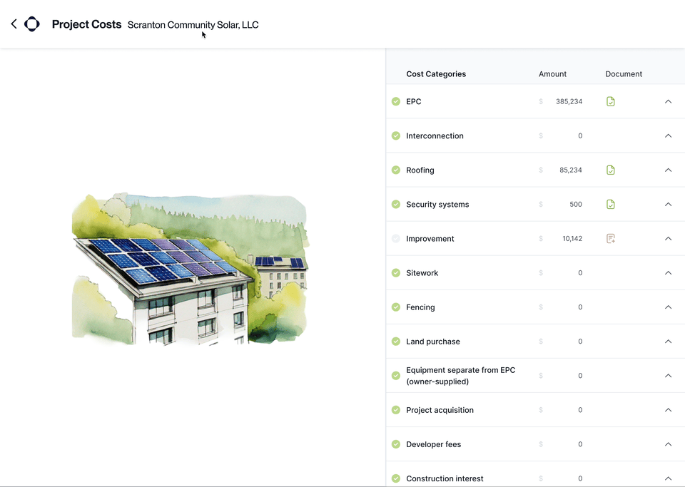
Project costs process
This establishes the value of the project for all major parties.

The process was slow and manual, conducted in Excel and over email. It limited Evergrow's ability to scale.
User-centered challenge:
Reduce confusion and follow-ups for developers of all experience levels when submitting project cost information.
Business challenge:
Reduce number of days from first contact to final cost seg report by at least 50%
Talking to internal experts, reviewing email threads and participating in calls showed that small clean energy developers faced real barriers to delivering an accurate list of costs & documentation


Wearing a design hat, I started by exploring how to best structure the cost intake experience itself. I sketched four different approaches in FigJam, ranging in how much structure and guidance we'd provide upfront.
I also sketched out the overall user flow, integrating this new feature into the existing platform.
Streamlined user flows can only be created on top of a strong, consistent internal process. I collaborated closely with our tax credit finance expert to understand all of the work that needed to be accomplished. We negotiated a standardized process that could accomodate the majority of projects.
I documented this in a swimlane diagram, which we used for further refinement. It also became a map for implementation planning.

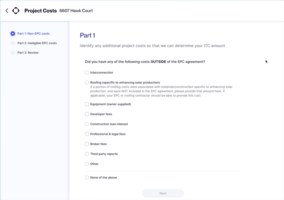
This prototype featured a document side-by-side for quick cost verification, progressive disclosure of detailed cost questions and a confirmation screen with total expected tax credit value.
Results?
Developers responded positively to inline guidance and final value calculation, but we observed areas of confusion:
No clear starting point
List of costs was overwhelming and distracting
Document side-by-side didn't add much value, but dominated the experience
We rethought what customers needed and simplified even more.

Instead of just designing a great developer costs UI, I focused on where and how information was gathered across the system.
We better leveraged internal experts and light customization to reduce developer burden
An ideal solution would tailor the form to each project's specific circumstances, but this complex logic was out of scope for a V1.
Instead, we did the next best thing: identifing two high impact questions that internal experts could reliably answer that would streamline developer information asks.
Simple form UI, backed by detailed rules
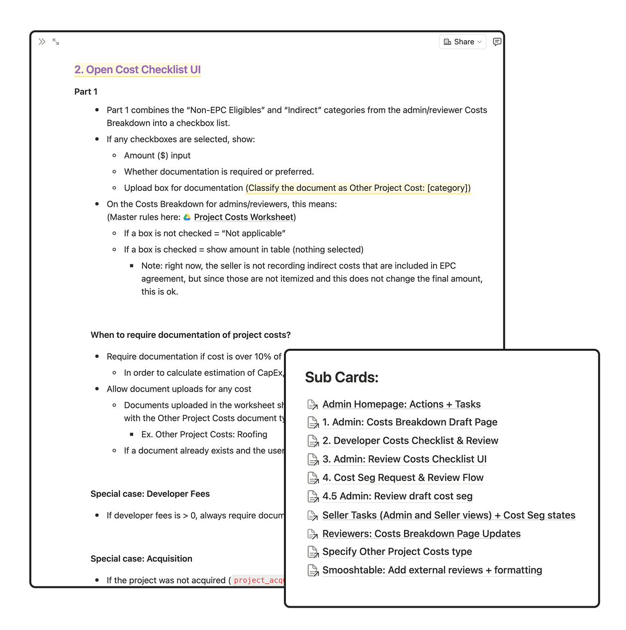
Documentation of the complete feature and handoff to engineering was a significant task. The project above outlines the developer experience, but this feature also included flows for interal expert "admins" as well as external accountants.
I wrote a series of PRDs and collaborated closely with our lead engineer to organize the execution of feature work.
Coming soon a quote!
-TBD, Evergrow
faster than manual processing
75% reported reduction in perceived stress
75% reported increases in feelings of belonging to a community

days reduction in processing time

I’ve launched a global app, built a startup from scratch and consulted for organizations in between. I’m looking for my next big project.
What are you working on?

